Architecture A4

Group A4:
Aimee McAvoy, Mark Glover, Diarmuid Porter, Darragh Sherry, Sean Heffernan & Callum Black

Project Title:
P2 Intervention of Making

Introduction to the Project:
We have been asked to make a meaningful intervention that improves the experence of a selected activity space.

The last project we carried out was in Nick's Warehouse in Hill Street, which is situated in the Cathedral Quarter of Belfast. This is an award winning restaurant which is opened for business throughout the day and evening. The building was formally a bond store for the famous "Bushmills" whiskey company. It then became a derelect pigeon loft before being transformed into one of Belfast's most popular restaurants.

After completing P1 assignment we were of the realisation that we would have to limit our intrusion into the daily activities within Nick's Warehouse. Therefore we decided to transfer our P2 assignment to an outdoor alternative location.

Sunday, 31 October 2010

Feedback from End Users

Quotes from the public/ end users of our installation:

Elderly man felt that it "Brightened up the space because the space is normally very dull and boring".  He "couldn't understand how Sean was walking on his head" whilst he was looking through the camera obscura.  He also commented on how he "disliked the St Anne's sculpture" as he "doesn't see the artistic point of it".  Overall he thought it was a "perfect" installation.

Darragh explaining how the camera obscura works to a passer - by


Two women "Loved the addition of colour" and wanted to know if "it was always going to be here [St. Anne's Square]" because they "think it should be a permanent fixture".

Young Girl "I loved running through the shapes.  It is like playing in the park".

Young girl running through the shapes and spaces

Teenager "I could relate to this product as I am currently studying about how cameras work and different lens in school in Physics class".

Woman "I am artist and I just loved the abstract shapes you created of the landmarks of Belfast City.  Good job".
  
Woman looking through camera obscura


Thursday, 28 October 2010

Review of our Installation

Overall we feel that our installation was a sucess.  The bright and vibrant colours of the partitions attracted people to our installation, as the area in St Anne's Square where it was located lacked colour and interest.  The area was in fact short listed for the "Carbuncle Cup" which awards the ugliest buildings in Britain.  One describes it as "a confused barcode".

Once we had grabbed the attention of the passers-by, many then became intrigued by the camera obscura.  Many did not realise the concept of the installation until they were able to use it themselves.  They were fascinated by the fact that people could look through a simple box and could see an inverted image displayed on the screen.  It appealed to a wide audience, eg the older, more mature people were interested in the theory behind the camera obscura whilst the younger children found it fun to be able to run through the partitions.  And as they did so, they were able to become more aware and get to know places in Belfast.

From our testing of the installation and feedback from some of the users, we made a few changes to our initial set-up of the installation.  We moved the position of the partitions in order to catch the attention of people coming and going from Emily Lane, the car park and the main entrance.  This allowed us to have a wider audience. 

The distance between the partitions were approximately 2 metres apart to allow the users to enjoy the full experience better by being able to comfortably move through the space and shapes of the iconic Belfast partitions.

We were aware that the weather in October can be wet and windy.  Therefore we had to make our installation out of materials which were able to withstand such conditions.  On the day, it proved to be an essential criteria as the weather was abysmal  with torrential rain and light winds.  Luckily our installation did stand up to such inclement weather conditions.  We did however have to be conscious of the importance of recycling and minimising our budget spent on the installation.  Therefore we used recycled MDF and purchased paint from a shop offering damaged paint products which was less expensive.


Wednesday, 27 October 2010

Testing our Final Design

In order to get feedback on our installation we decided to test it on site.  We hired a van to allow us to transport our partitons down to the site.  As we predicted people's eyes where caught by the colourful partitions and they were eager to investigate further.
We talked to and interviewed people and found out that they were particularly interested in the camera obscura and how it worked.  Children thought it was fun looking at their friends walk through the partitions whilst older people found the history of the camera obscura fascinating.

A passer - by looking through the camera obscura at the partitions

The installation is eye - catching as the partitions are a vast size and the colours we used are bright and vibrant in order to attract people to our space.  They are also a dramatic contrast from the white area of St. Anne’s Square.

We positioned the installation so that people can arrive at the camera obscura from Emily Lane and the St. Anne's Square car park.  People can also arrive at the main entrance to see the partitions.
We made the space between each partition approximately 2 meters apart so that they were at a comfortable distance for people to move in and out and discover the shapes and space.  They were placed to encourage pedestrians to walk in a detoured path.


The use of the camera allows people to perceive the place in a totally different way due to the inverted image.


Our installation was built to suit all ages of people.  The older people found the camera obscura interesting whilst children liked running through the shapes and spaces.  It was very appropriate for families.


Monday, 25 October 2010

Painting the cut-outs

We painted the mdf cut-outs using emulsion paint and covered it in a protective gloss.  This was to ensure the paint did not run off the mdf if it rained or came in contact with water.  We purchased the paint at Harry Nablets located on North Street, Belfast.  This shop sells paints and other decorating materials and instruments at a cheaper price which are second hand or slightly damaged.

Our painting disaster!

 
Aimee painting the partitions


Sunday, 24 October 2010

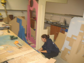
Making the MDF cut - outs

The cutouts were made from mdf which we purchased at Macnaughton Building Centre located on the Balmoral Road,  Belfast.
The images of the 5 landmarks in Belfast were drawn onto the mdf and cutout using a jigsaw as shown below.

Drawing on the mdf sheets


Drawing the 5 different landmarks on the mdf sheets


Cutting out the shapes:


Sand paper was then used to smooth the edges of the cut outs.


6 and 8 cm timber "legs" were attached onto the cut-outs to provide support and allow them to stand up.  We were given the timber free of charge from one of the group members father.  This timber can be recycled after our installation presentation.


H & W crane cut-out


Testing the Camera Obscura

We made a model of the camera obscura using black card, tracing paper and masking tape.  On the front of the box there was a hole which light travels through and the back of the box consists of tracing paper which was kept in the dark to allow the image to be inverted.  The image was hard to see and therefore this model was unsucessful.

We placed a sheet over the camera obscura to keep the back
of the camera in darkness and the front of it in light.  It was
important to do this to achieve a clear, focused image.


Testing the camera obscura


For the next model, the box was made out of wood.


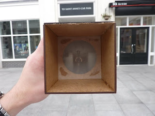
The box containing a convex lens.


A lens was added in the box.  This made the image on the screen more clear and easy to see. 


An inverted image of the objects can clearly be seen.

Testing the camera obscura on-site:

An inverted image of Sean standing in St. Anne's Square


An inverted image through the camera obscura of St Anne's Cathedral

We found inspiration of the camera obscura box from the following link:
http://www.youtube.com/watch?v=PdUjGGgcQo4

Final Design

For our final design we developed the camera obscura idea.  In order to attract people to our creation we decided to design a "maze".  This would allow people to become more inquisitive about the area and be intrigued about what is in the centre of our space.

This sketch shows the 2D mdf cut outs surrounding the camera obscura box.
The shape of the exterior walls reflect the path of light as it passes through a lens.
The users must walk in the path shown in order to reach the camera obscura box.  When they reach the box, they will be able to see an inverted image of the other users walking along the path through the maze.


Yet we then realised that the mdf cut outs of random shapes had no context.  We wanted to change this and so we changed the design to allow the cut outs to become 5 of the main sites and landmarks in Belfast.  This fulfilled what we first initially wanted...to allow people to see parts of Belfast in the enclosed area of St. Anne's Square.


Final design: Mdf objects include The Waterfront Hall, H &W cranes,
Cavehill, The Albert Clock and St. Anne's Cathedral.